Plainsong Espresso
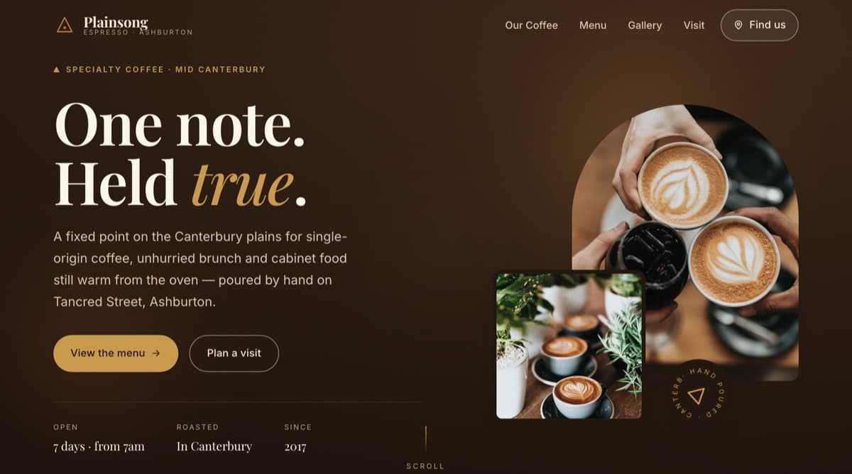
A warm, editorial café website designed to turn 'where should we get coffee?' into a decided visit — menu, atmosphere, and location answered in one scroll.
- Business Type
- Independent café
- Category
- Café & Hospitality
- Project
- Demo concept build
 Open Live Demo
The Problem
Most local cafés live on a Facebook page and a Google listing. Opening hours are buried in comments, the menu is a photo of a chalkboard from two years ago, and there's nothing that communicates what the place actually feels like. Visitors deciding between two cafés pick the one they can picture themselves in.
The Goal
Give a café a single page that answers the three questions every potential customer has — what do you serve, what's it like inside, and when are you open — while making the brand feel as considered as the coffee.
Editorial and unhurried. A warm roast-brown palette pulled from coffee itself, serif headlines with generous whitespace, and photography treated like a magazine spread rather than a grid of thumbnails. The menu is designed as a piece of typography — not a PDF download — so it's readable on a phone in the queue.
- Full menu as fast, readable text — no PDF, no pinch-zooming
- Opening hours and location visible without scrolling hunt
- Atmosphere-first photography layout
- Mobile-first design for the 'coffee near me' moment
- Scroll-triggered reveals that stay out of the way
- One-tap directions and contact
Discovers
Someone searches 'café near me' or gets a recommendation and taps through.
Evaluates
Within seconds they see the menu, the room, and the vibe — enough to picture the visit.
Decides
Hours confirm it's open; one tap opens directions. The decision is made before a competitor loads.
- Hand-coded HTML / CSS / JS
- No heavy frameworks — loads fast on café wifi and rural mobile
- Responsive, mobile-first layout
- Fewer 'are you open?' phone calls interrupting service
- A menu that's updatable in minutes, not reprinted
- A stronger first impression than a Facebook page for first-time visitors
- Somewhere for press, reviews, and word-of-mouth to point to
This project is a demo concept created by Pureza Digital to demonstrate what a modern website could look like for a local business of this kind. It is not a commissioned client project, and any resemblance to existing businesses is illustrative.
Want something like this
for your business?
Tell us about your business and we’ll show you what a modern website could look like for you — including a free review of your current online presence.